Disney Parks
Four years at Disney taught me that the hardest interface is the one that spans a screen and a physical place — a band on a wrist, a voice in a resort room, a paid upgrade inside a system guests already knew by heart. Every decision had to survive real park conditions: crowds, noise, spotty connectivity, kids in tow, and a guest's attention already stretched thin. For some of them, this was the only trip to the park they'd ever take, planned for months or years — so we held everything to one standard: Distinctly Disney.
It had to feel magical and effortless. And every idea still had to clear legal review before it shipped — a constant balance between what guests wanted and what was actually approvable, which meant getting good at iterating fast toward the version that worked for everyone. It could never take away from the moment. Only add to it.
MagicBand+
I came onto MagicBand+ after a prototype had already sold leadership on the idea — my first job was archaeology: interviewing the team to find what execs had actually bought into, then turning the features hinted at in that prototype into something real. The scope kept growing. What began as a Disney World launch expanded to Disneyland — the first bands there — with no existing system to build on, so I worked across product, ops, and engineering to define one from scratch.
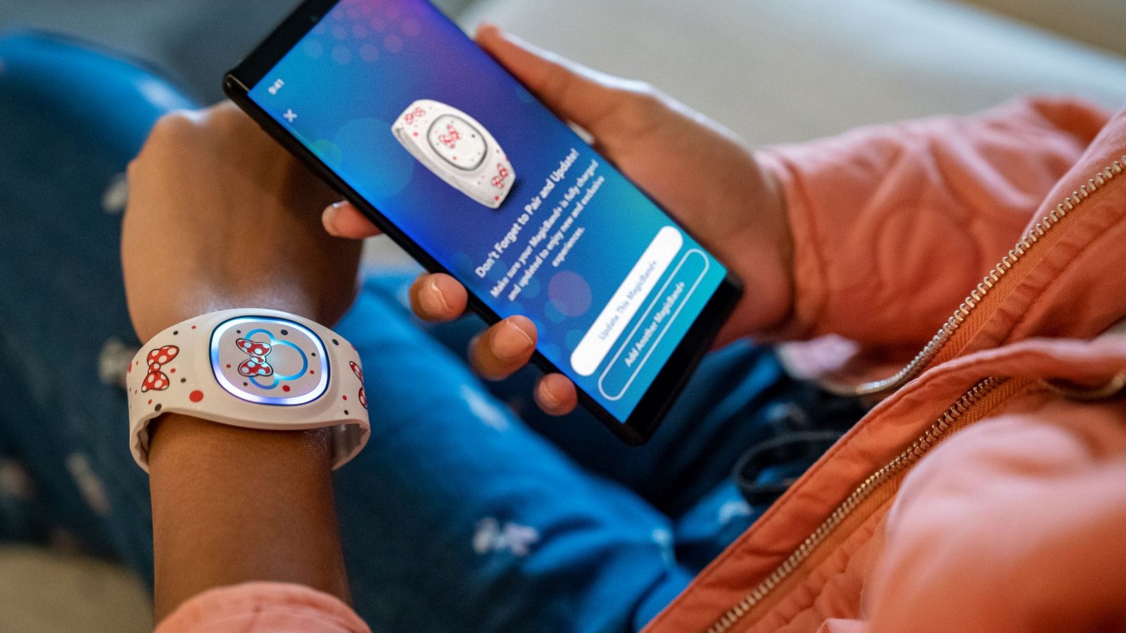
Pairing a MagicBand+ from the native app.
Not just a vendor
Amazon built the physical band. I worked with their team regularly on firmware, sensors, and haptics — testing prototypes myself and feeding back what guests would feel.
Built where guests already were
Setup, band management, and customization lived inside the Disney World and Disneyland native apps, alongside in-park games designed for guests wearing them.
Proven in the park
Interviews shaped what to build. In-park testing with real bands confirmed it worked — sensor placement, game responsiveness, all of it.
Hey Disney
I was brought onto Hey Disney as the MagicBand+ subject matter expert — to shape how connectivity between the two would work, and find where MagicBand+ could add to the in-room experience, like games resort guests could play together through the device. From there, my role expanded: contributing design for the device's screen, helping refine the tool that shaped the voice's actual sound, and rewriting responses so they felt Distinctly Disney instead of robotic. Underneath all of it sat a harder question: how do you make something that's listening feel safe and trustworthy, especially with kids in the room?
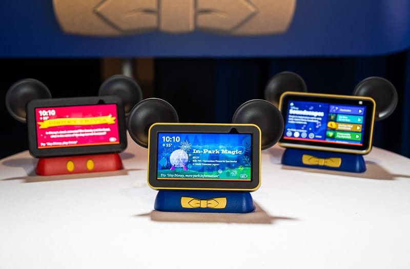
Hey Disney devices, each surfacing a different in-room experience.
Sounding Distinctly Disney
I helped refine the tool that shaped the voice's actual sound, and rewrote responses that had started out reading like a machine wrote them.
Designing for comfort
An always-available device in a family's resort room raises real questions. I worked through permissions, onboarding, and disclosure so guests felt in control, not surveilled.
Built to outlast me
Once the core experience worked, the team grew to take it forward, and I moved back to MagicBand+ full time.
Lightning Lane
Lightning Lane is the paid evolution of FastPass+, and for most of its life it was one of the most closely-guarded projects at Disney — secrecy that shaped how we worked as much as what we built. We couldn't tip our hand, so research meant getting creative: crafty, indirect ways to test ideas with guests who had no idea what they were actually helping shape.
Before I could design anything new, I had to untangle what already existed. FastPass+ turned out to be layers of business rules built up over years, and they weren't the same for everyone — resort guests, day guests, cast members, Disney Vacation Club members and more. Documenting all of it, while designing the new rules Lightning Lane would add on top, was a massive undertaking on its own. What began as a Disney World product later expanded to Disneyland, and I helped define the three product tiers and designed the original naming and identity — renamed Lightning Lane, with new iconography, shortly before launch.
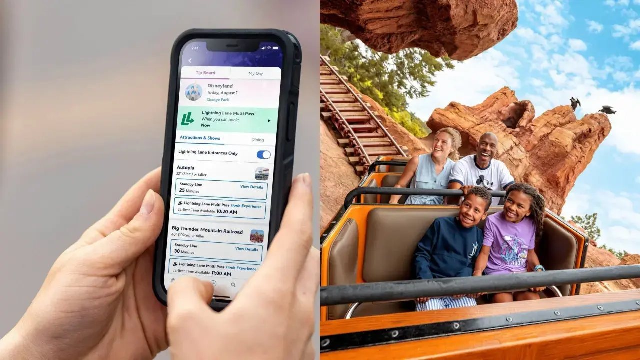
Booking a Lightning Lane pass in the app — and using it in the park.
Under wraps
We couldn't reveal what we were building, so research meant getting creative — crafty, indirect ways to test ideas with guests who had no idea what they were actually helping shape.
Untangling years of rules
FastPass+ turned out to be layers of business rules built up over years — different for resort guests, day guests, cast members, Disney Vacation Club members, and more. Mapping all of it, while designing new rules on top, was its own massive undertaking.
Two teams, one product
I led different design across native apps and web, each with different ecommerce back-ends, ensuring it all stayed cohesive.
The rest is a conversation. The tradeoffs across three very different products — a wearable, a voice device, a paid evolution of a system millions of guests already knew — that's the part worth talking through.
Ask me about it →